
Structured chaos.
His world, my hand.
When I got the assignment to redesign an album cover for an artist of my choice, I instantly knew what to pick. One of my favorite artists, with a very cool design style on his album covers. Smokedope2016.
I could have gone with any of his albums or singles, but I decided to go with the one that intrigued me the most. The Peak is Smokedope's newest album, his sixth. The theme of mountains, the matching name. I thought I could make something special.
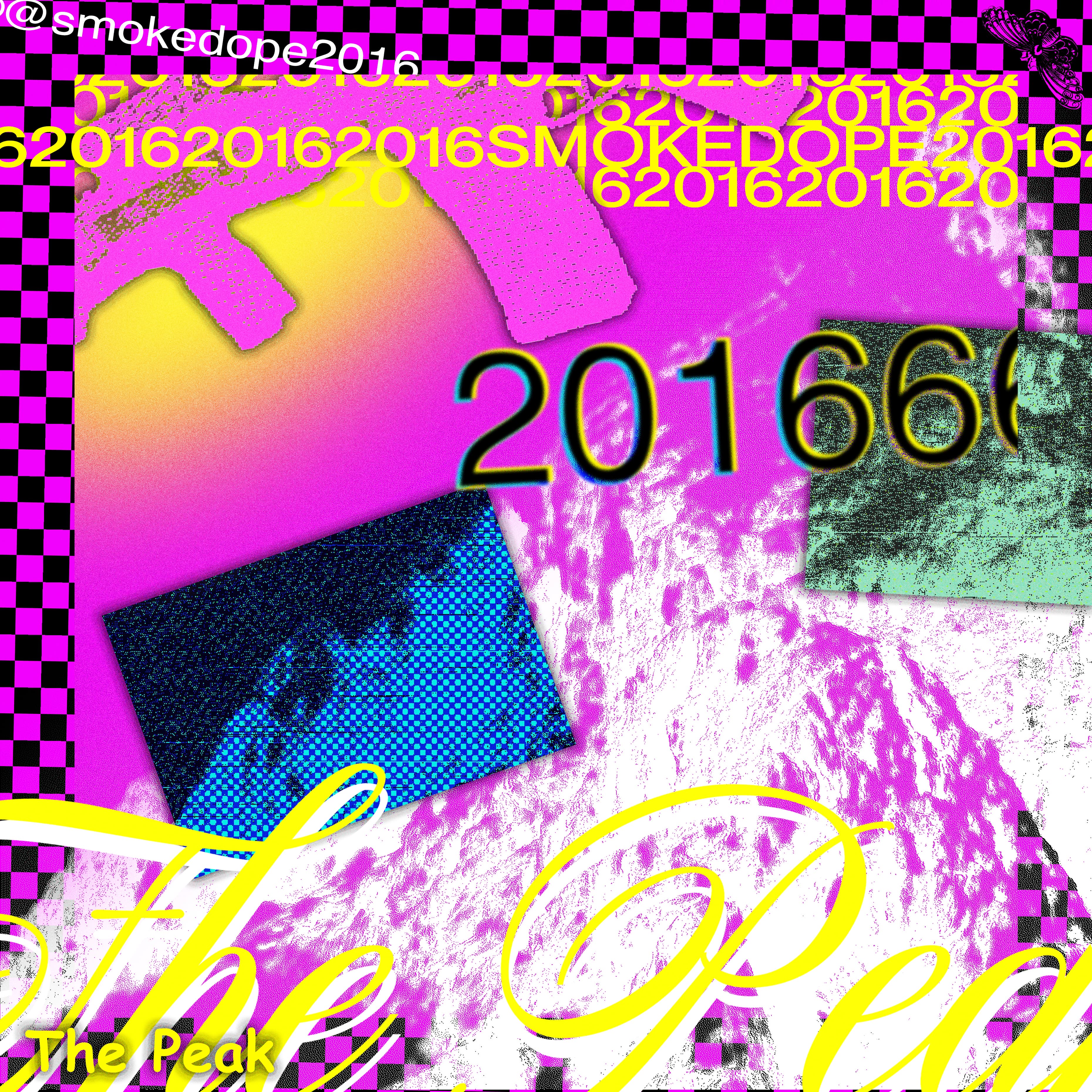

The cover
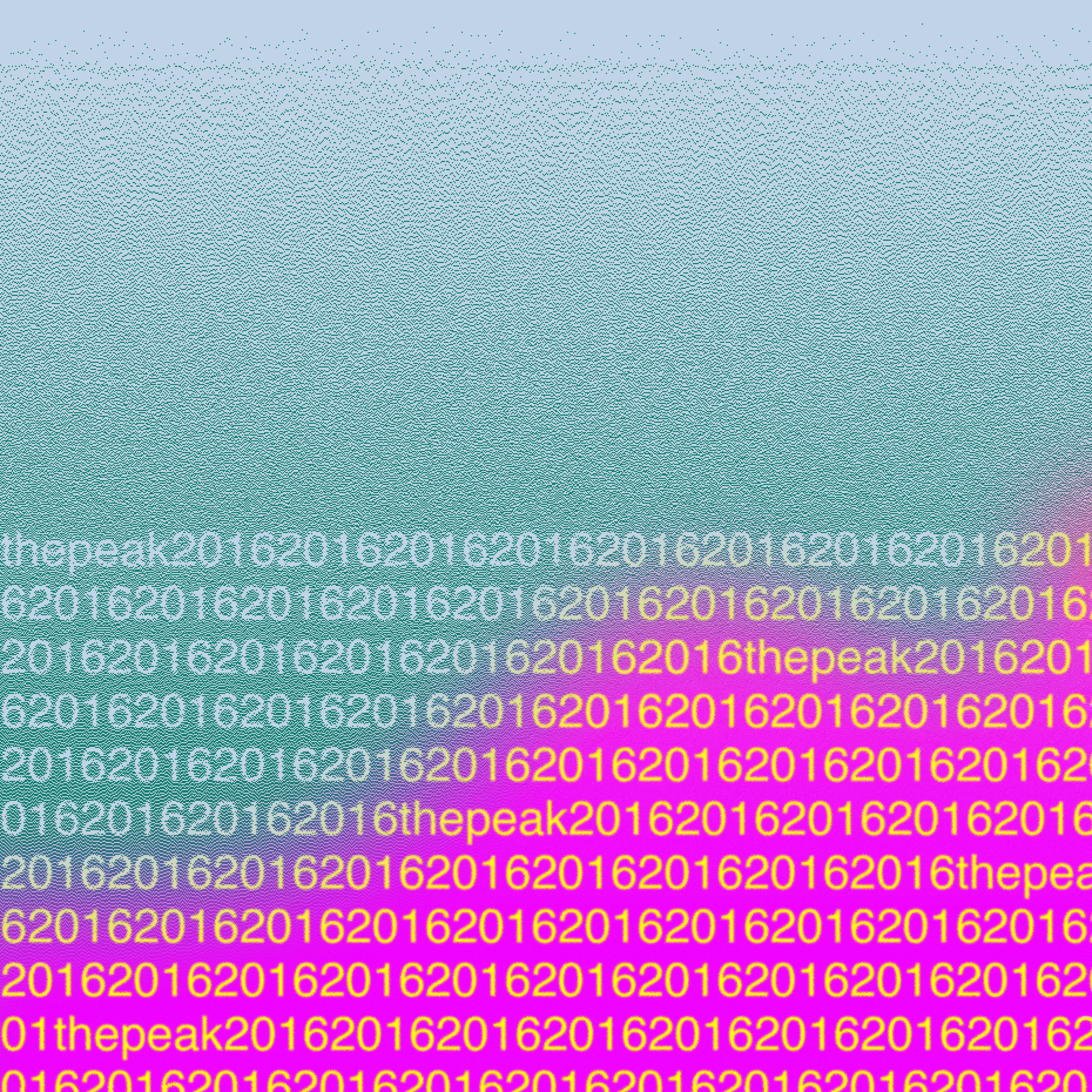
The cover is all about structured chaos. Something I noticed is an ongoing theme in Smokedope's discography. I wanted to make something similar to his covers, but with my own style mixed in. I decided to use the mountain ("The Peak") as the main element across the whole design, to bring some cohesiveness to the otherwise chaotic layout. Using "2016" throughout all parts ties everything together.
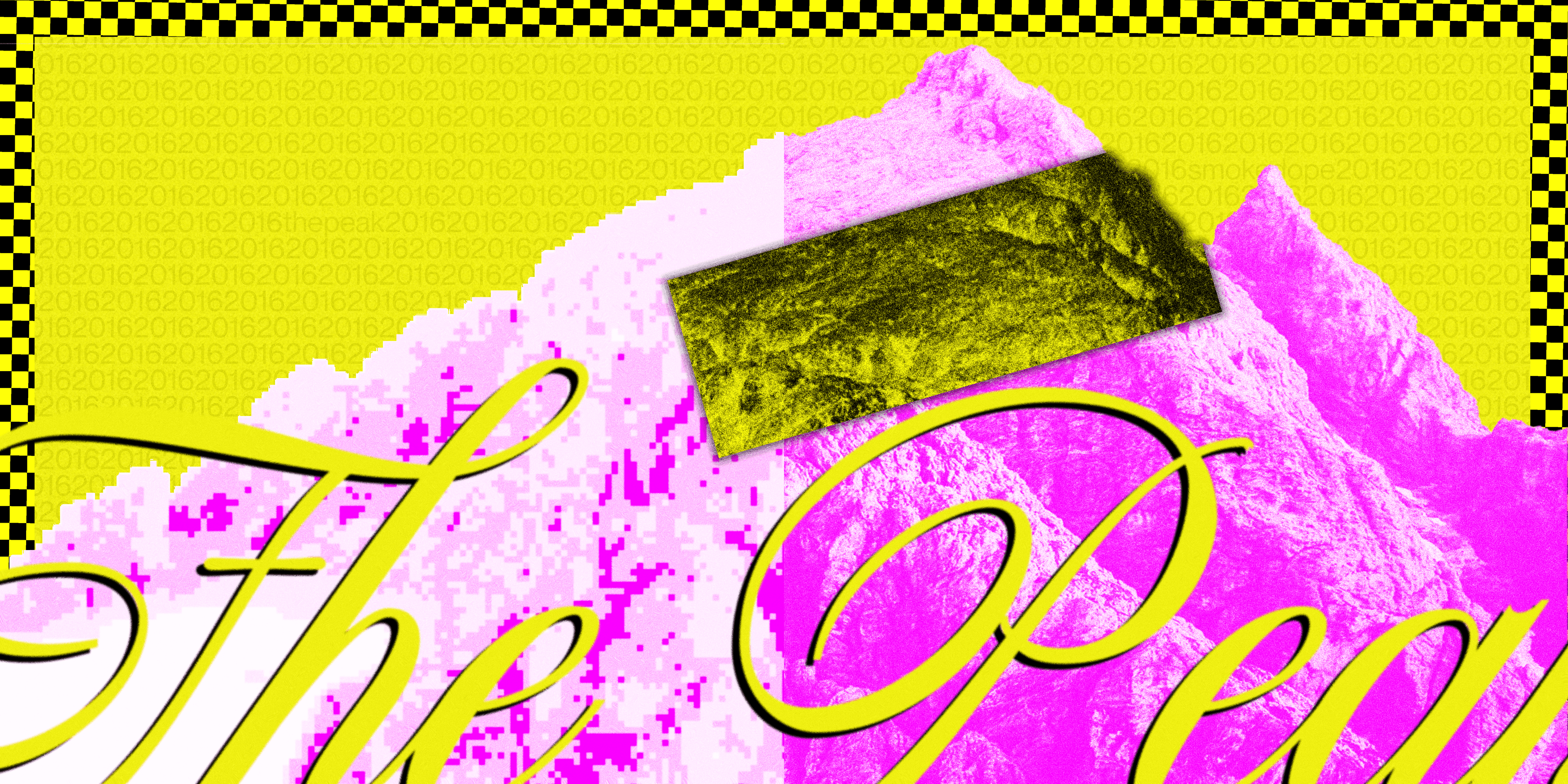
The inside
The inside was the third piece I designed, spending a lot of time contemplating how to make it fit without seeming too repetitive. I decided on a clear colour hierarchy. Yellow as the dominant, with accents playing off it. I could have added more elements, but I decided less was right given everything else going on. I'm very happy with the result. It ties the whole cover design together.

all the way through.
I fell in love with the "anti-design" aspects of Smokedope's covers, especially The Comeup, Icey Soles, and 2016lyfe. I wanted to bring that into every part of my design.
For the tracklist I tried a lot of different styles, but ended up with a distinctive type layout, using the mountain and the gun from the original, as well as the checkerboard pattern I pulled from the 2016lyfe album art.